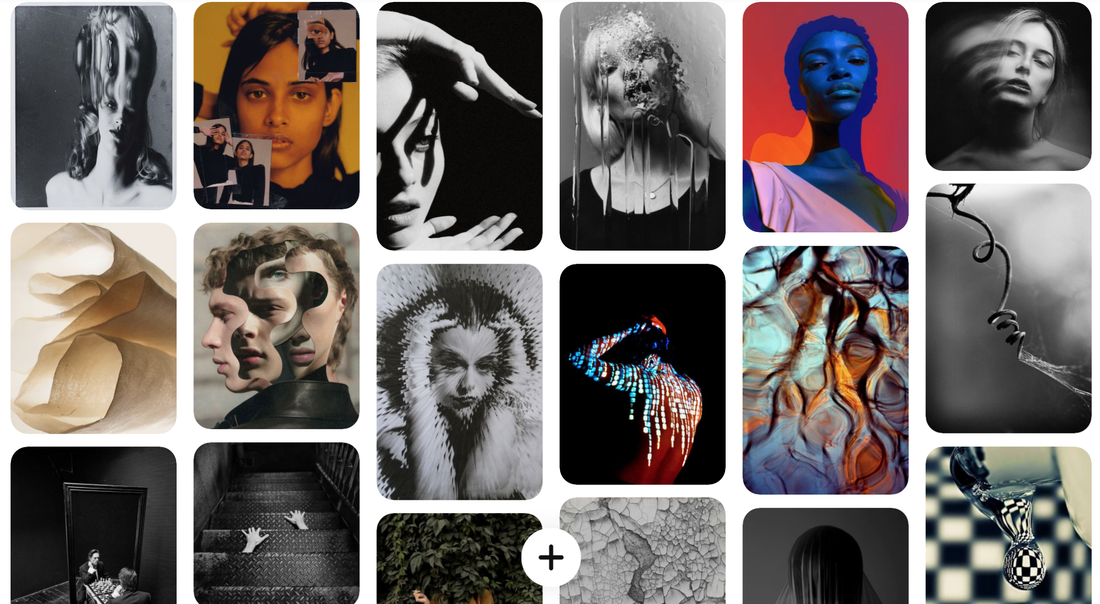
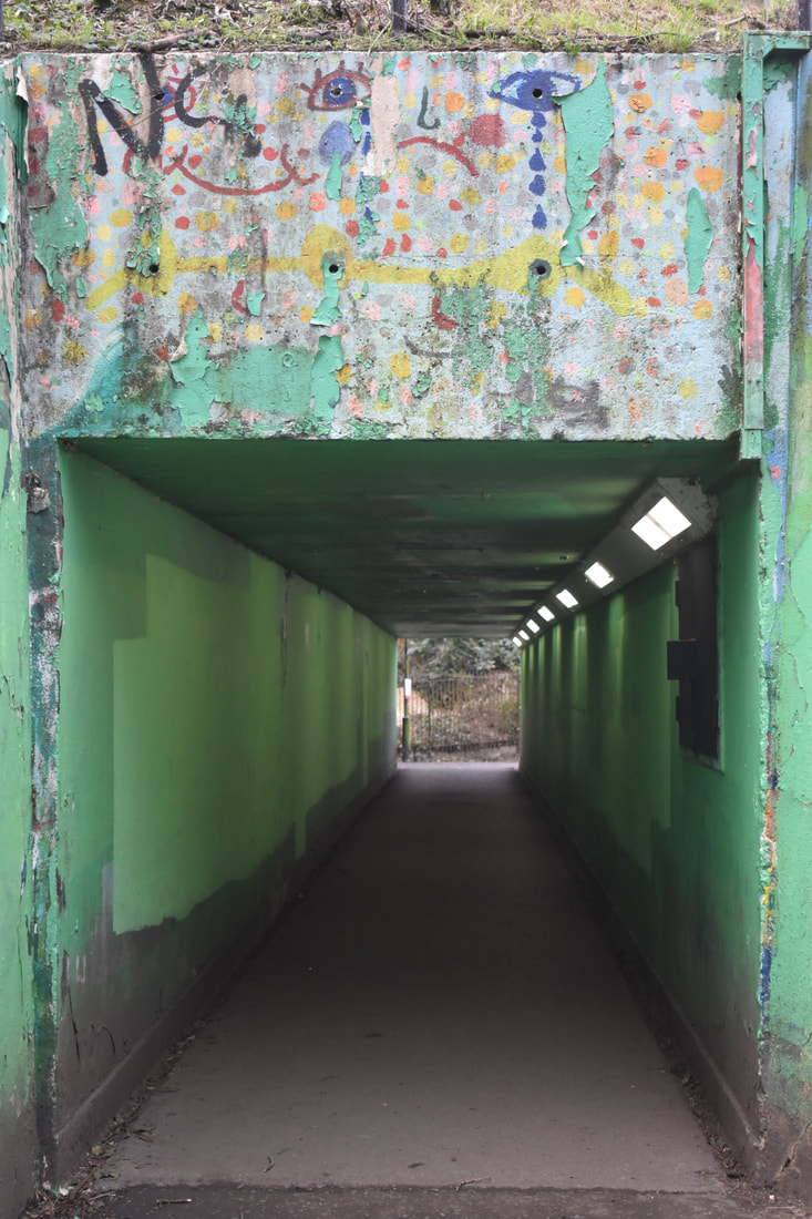
ABSTRACTION
discomfort shock engraved in your brain weird unsettling
|
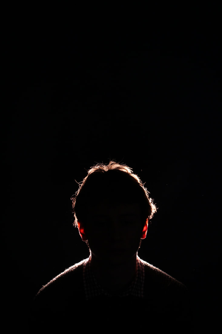
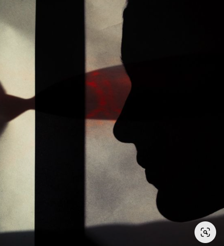
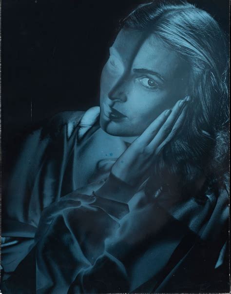
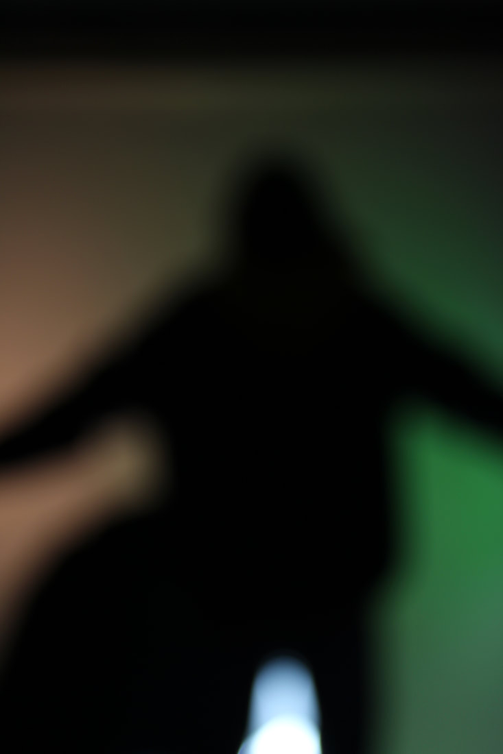
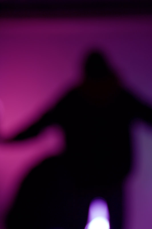
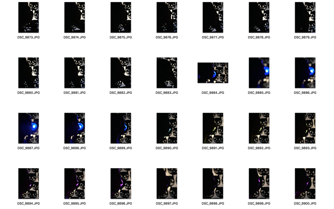
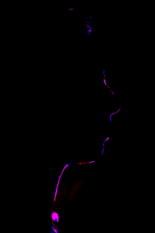
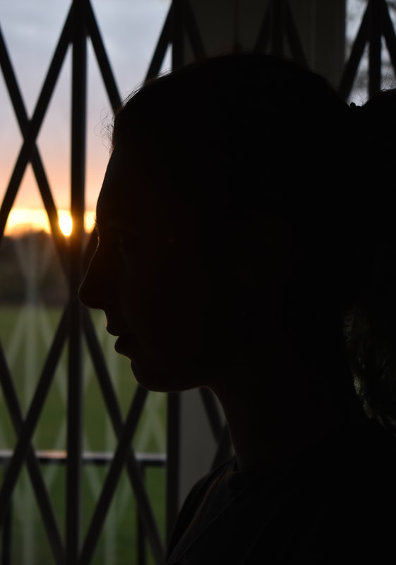
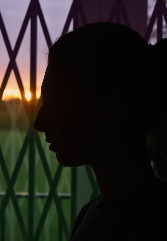
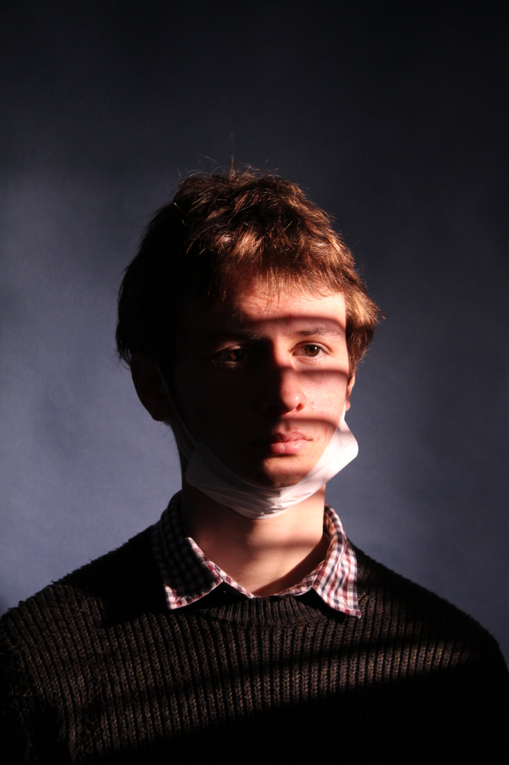
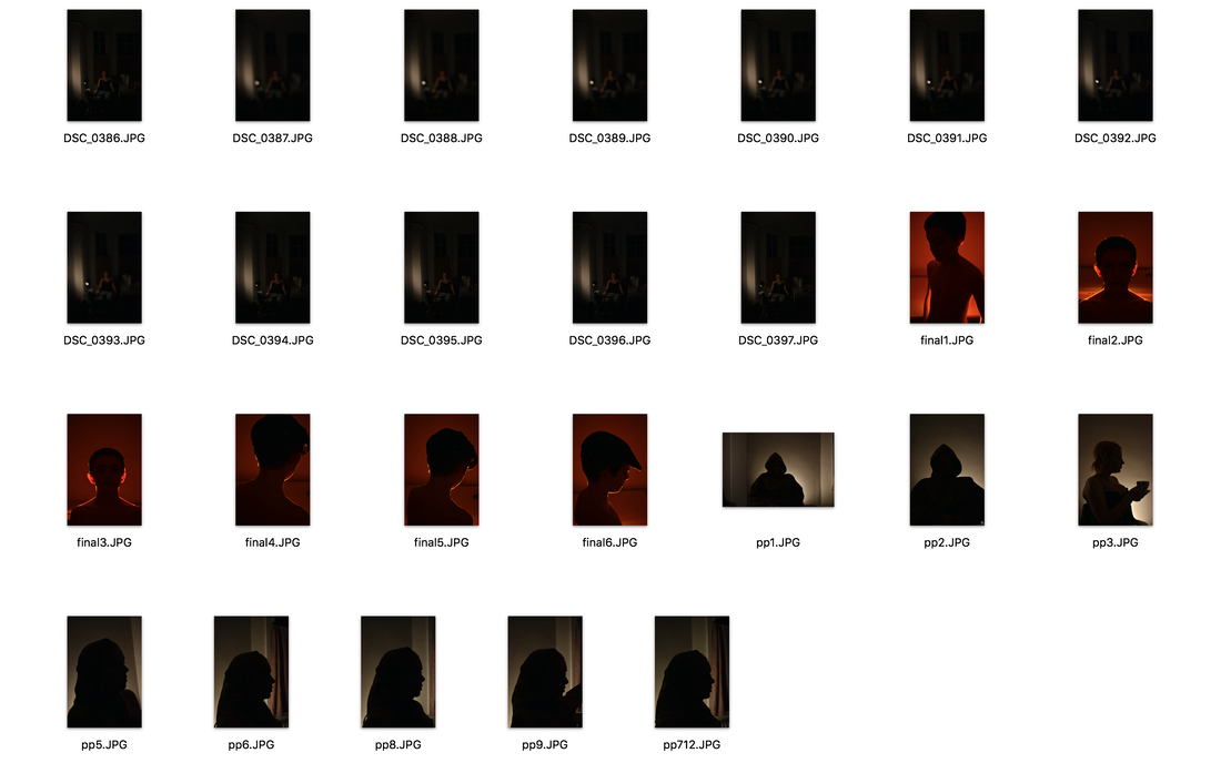
These are my favourite photos from my first development as i like the shapes and i think the background looks more like jack davisons work than the LED light below however the shapes are more interesting in the LED one.
|
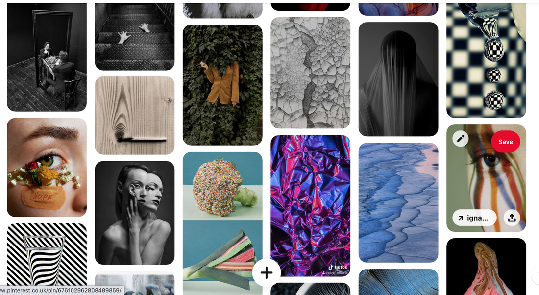
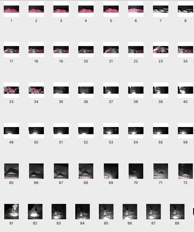
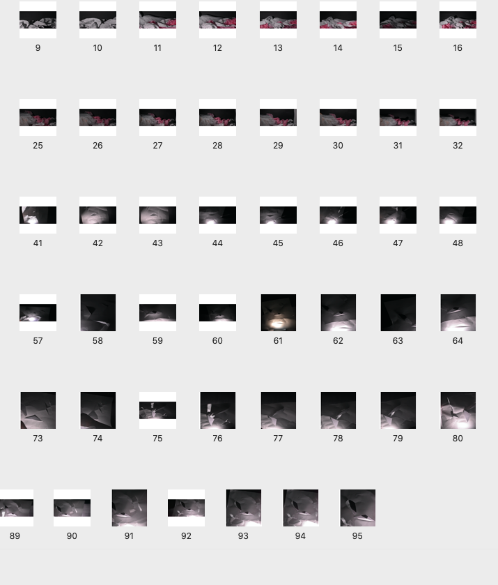
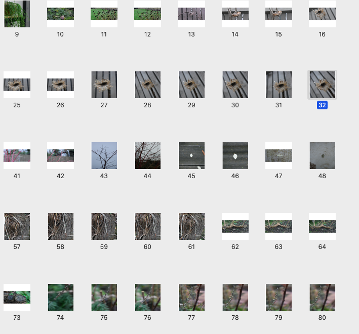
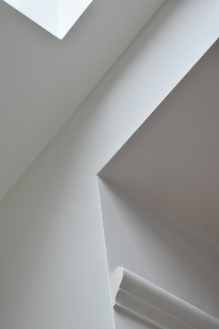
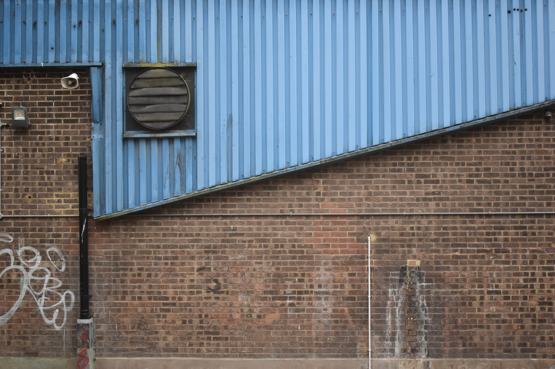
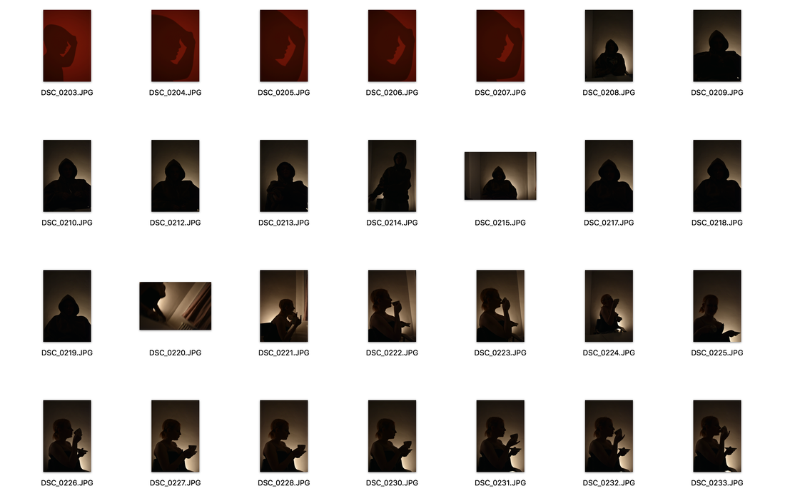
The white paper test
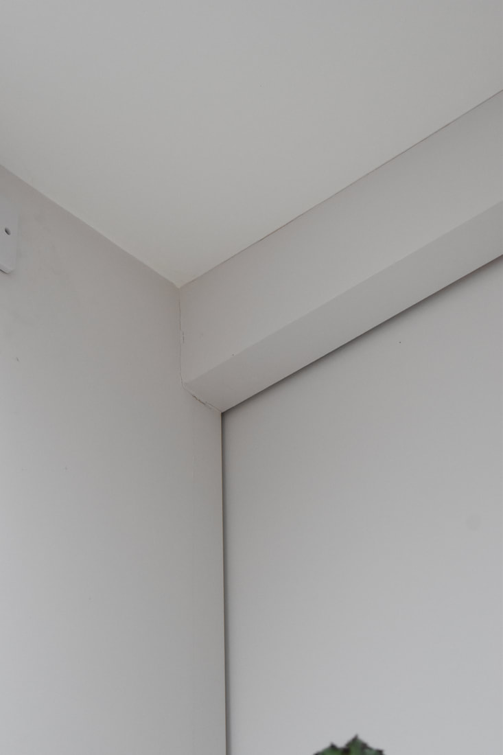
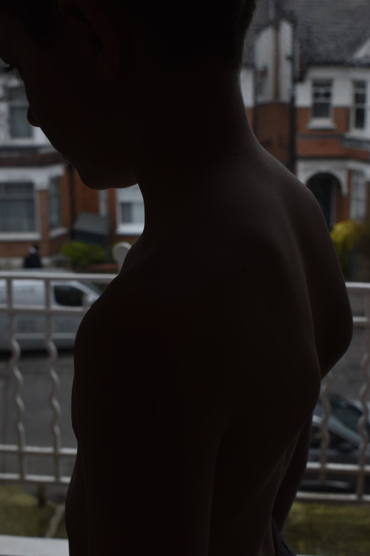
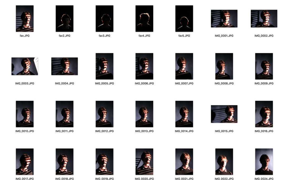
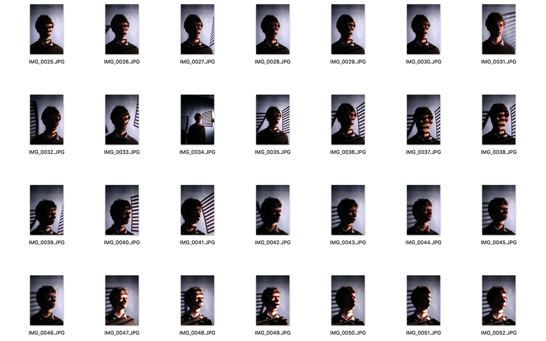
for our first task we took a single piece of plain white paper and had to take 24 different images. we were allowed to fold twist and crumple it but not cut or tear it, we also used different light sources (like torches and sometimes filters) at different angles to create shadows at different places. we also thought a lot about composition and where we placed our camera
I really like the tone and contrast of these images with the bright white next to the black shadows however they do not look very abstract to me as they are not very close up and dont fill the whole frame. To make my photos more abstract i am going to take the photos close up and have a sharp focus on the folds. when someone looks at the photos i want them to be unsure of what it is at firts glance
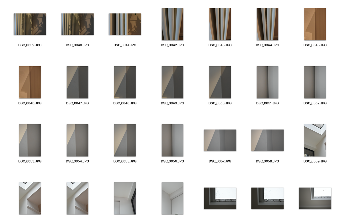
A good start but the contact sheet images are far too small it is impossible to look at your set up can these be made bigger with fewer items on a page
Abstract development
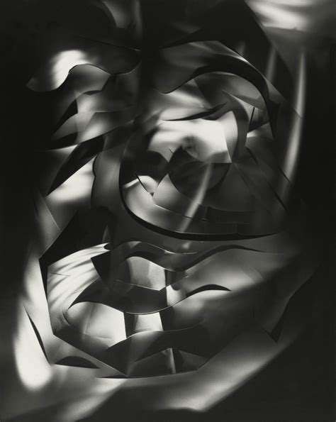
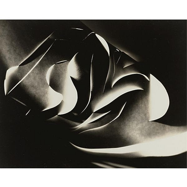
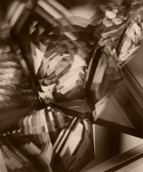
Francis Bruguière
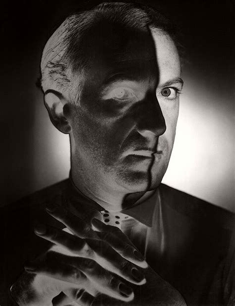
Francis Bruguière was an American photographer who's photography career begun after meeting photographer Alfred Steiglitz a modernist photographer even though his photography ended up being a part of the photo sucessionist movement. and he veiwed photography as a medium for investigating and experimenting with form space and structure; he was also very interested in the double exposure technique which you can see he used in the far right photograph. In the photos i am looking at he created paper abstractions just by cutting parts of the paper and using light and shadow to minipulate them.
|
|
|
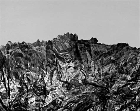
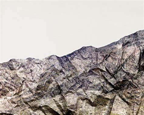
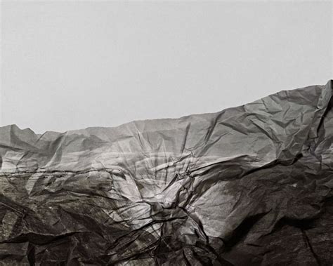
Brendan Austin
Brendan Austin is a landscape photographer who became inspired to take these paper mountian photos after walking alongt the mexican border. he was also interested in blurring the lines between fiction and non fiction so when you first look at the photo you are unsure weather it is a rock face or a piece of paper. and he claimed the foundations of his work were It is the examination of nature and our influence on our surroundings.
|
|
|
Well done a solid response to the set task the Austin work is strong but I would have liked you to get a little closer in your compositions. Also be careful with your focus some of the Bruguière work looks a little soft.
|
|
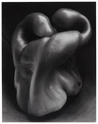
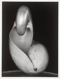
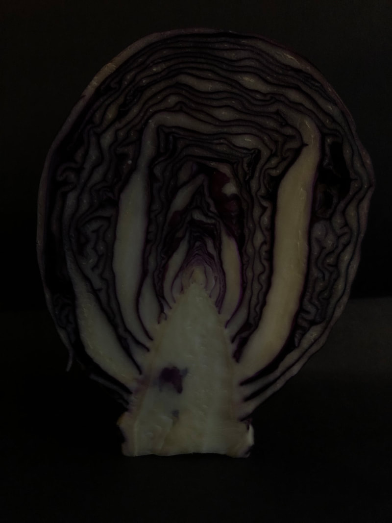
Edward Weston
|
|
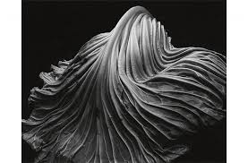
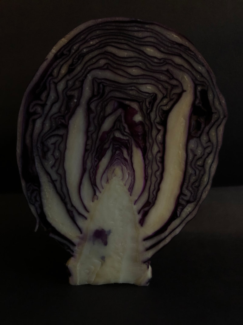
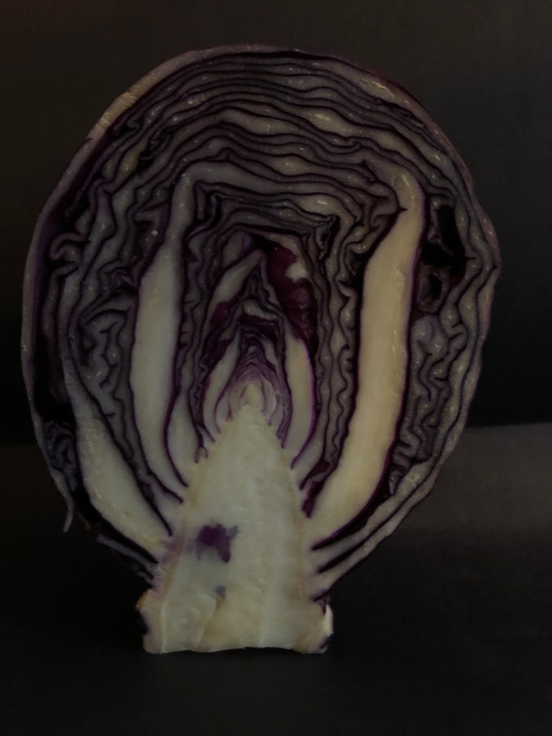
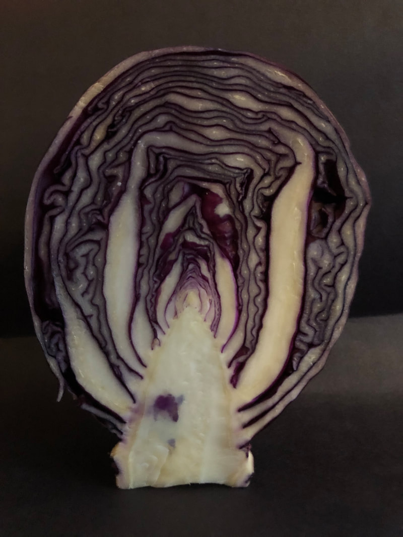
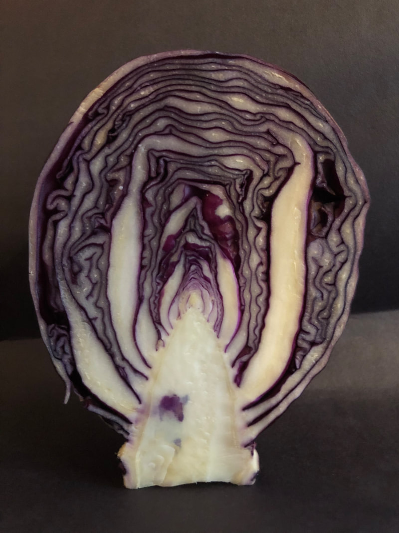
cabbage 1931
|
Edward weston is an american photographer who is considered to be the most influential americam photographer of the 20th century his work spanned a multitude of themes including some nude photography, but i am focusing on his still life photos.Where he took close ups of different natural forms like fruit and veg but with a very high aperture so he could show the forms shapes lines and textures in extreme detail so that every part if the image had a fine focus. In order to achieve this incredible detail he needed an aperture a lot higher than f64 which was what his camera went up to so he made his own pinhole one which would have been the equivelent of f240 this tiny hole meant that quite a long exposure time of 4-6 hours was needed so once he set the photo up he would walk away and leave it for the day. since he had to expose them for so long the natural light would move meaning the whole subject would bet lit but also had shadow and this created a 'luminious' effect. Another very important part of westons work was his composition as he would spend hours just getting the perfect framing and was considored a mater composer. this is why helike the graflex camera so much as it allowed him to see his subject matter while photographing. As he was such a known and influetial photographer people often asked if he had rules to taking his photographs but he didnt and described his photography and his own style he developed as his language as an artist and that there we no rules just what you think is right or wrong. As he also did nude photography many saw a resembalane to the human body in his pepper photographs and he was trying to link two different natural forms together.
Natural Light
|
|

|
|
|
|
Artificial light
|
|
Well done some strong photography shot 12 is especially good your use of dark tones and heavy shadow works very well. But as mentioned previously make sure all images are in focus or that the selected area of focus is the right one for the shot.
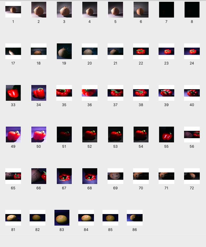
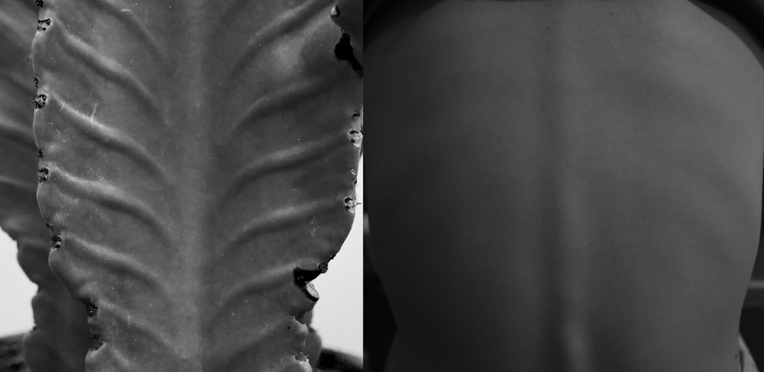
Abstraction of the body and nature
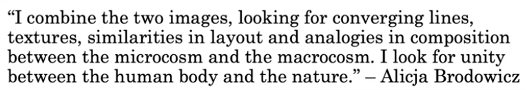
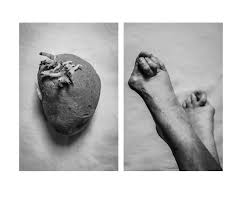
Alicja Brodowicz
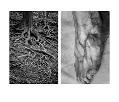
she made a set of photographs of the human body and different parts of nature and placed them net to eachother to show their similarities. she has also editied them similarly so they both are in black and white and have a high contrast. i think removing the colour is what made her images so scuessful as when they are the same colour the similarly of the shape really shows through as there is nothing else distracting the eye.
|
|
|
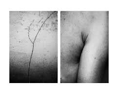
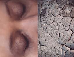
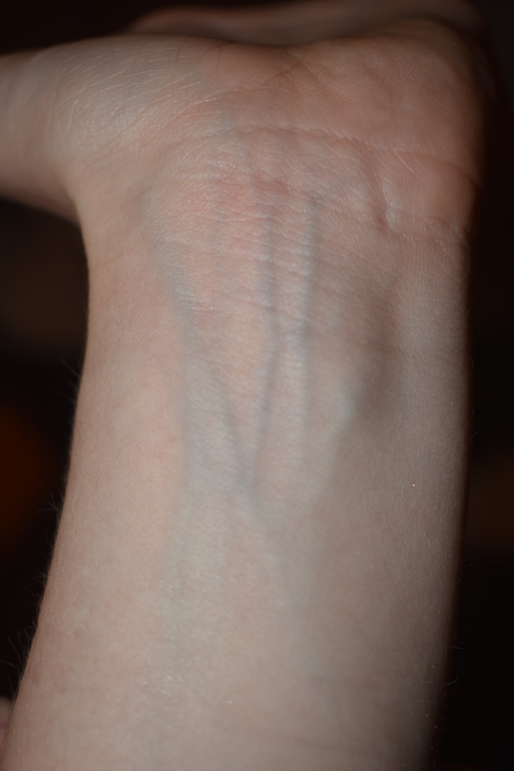
Agnieszka Lepka
|
|
|
ribs- perhaps you could make it about a spine. |
hair
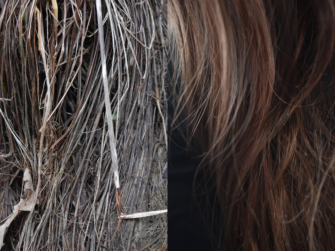
veins
|
|
Really like this work the images work really well in black and white. The contrast between the images is very effective.
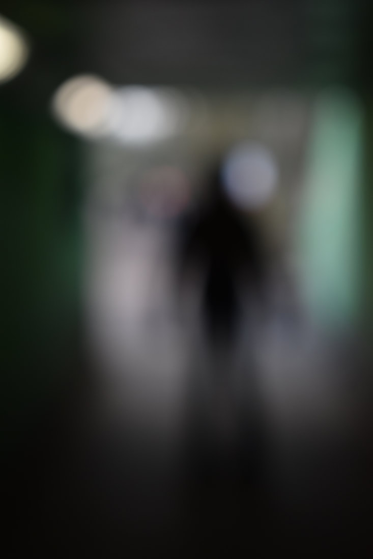
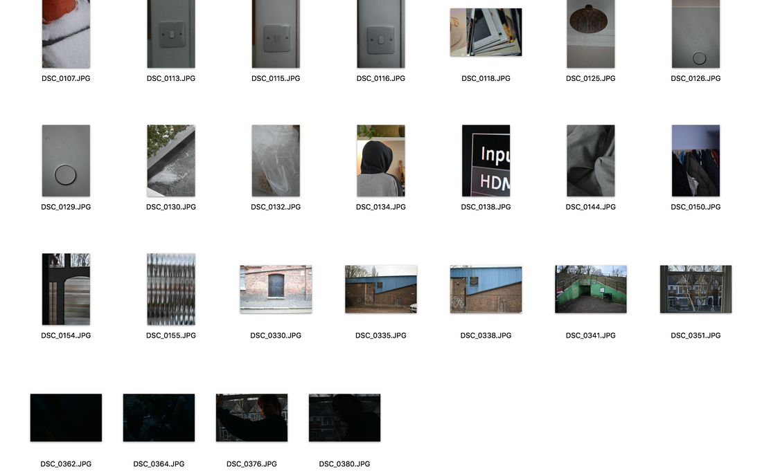
Abstract Portraits
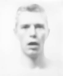
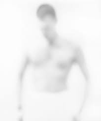
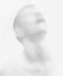
Bill Jacobson
jacobson is an american photographer who started his famous out of focus photography in 1989 all the way to 2002 and got his inspiration from old portraits he found of people at flea markets and when looking at them his first thought was they were most likely dead. around the same time as jacobson was prodcing this work there was also an aids epidemic going on and the soft almost half there men depicted in his photos could represent those lost to the disease. by using a soft focus i think jacobson wants us to ignore all the small details and focus on the main parts of the human and its form; there was also a lot of crontroversy around the epidemic and buy making the subject out of focus i think he is trying to show that it could be anyone and it doesnt matter about the personal specifics but that everyone is vulnerable.
|
|
|
|
|
|
|
Second Attempt
Well done Daphne a strong section the use of desaturated colours works really well I particularly like the subtle blue and red tones shone in the first response. Please upload the artist images for your Blumenfeld section
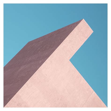
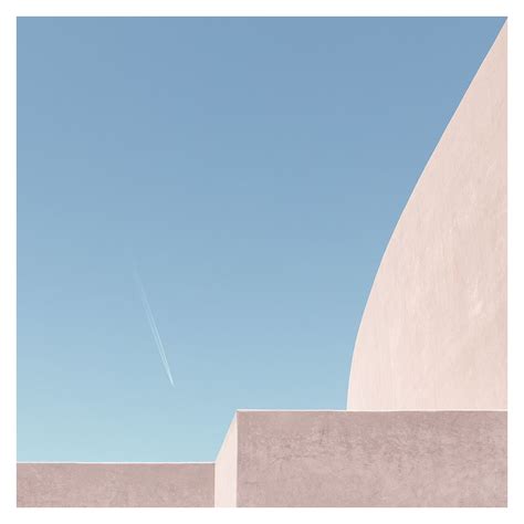
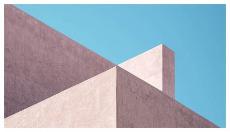
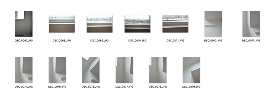
Johnny Kerr-Ambiguity
johnny kerr is an american photographer who for his projects ambigiuity photographed the Antoine Predock's Nelson Fine Arts Centre in Tempe, Arizona and he spent hours studying the architecture
|
|
|
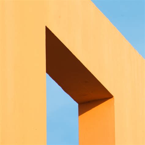
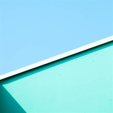
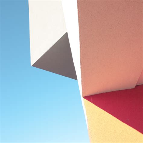
Matthieu Venot
Venot is a French contemporary photographer who takes very abstract geometric images using different and interesting archtectural structures. to achieve these amazing images he only photographs when the weather is perfect with no clouds or disruptions in the sky as he uses it as a plain background like one would in a studio and it helps make the architecture stand out and he says its his way of not disturbing the composition. and his choice of the light and bright pastel colours is his way of transmitting his own personal optimism through the photographs
|
|
|
|


|
|

|
Please add information about the work of Venot to go alongside the visuals you have uploaded
Sarker Protick-Abstraction of Personal Truth and Temporality
রশ্মি / Raśmi / Ray from Sarker Protick on Vimeo.
|
|
Abstraction 3 Strands
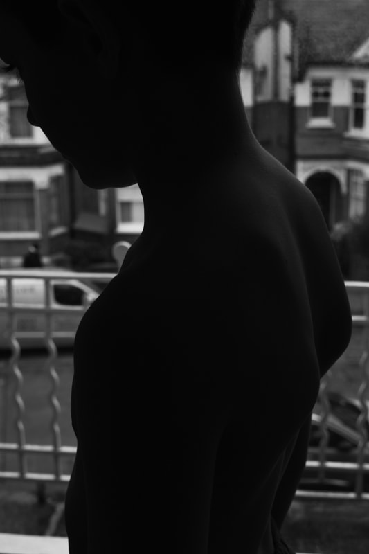
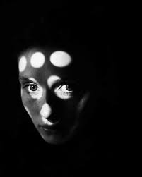
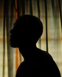
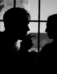
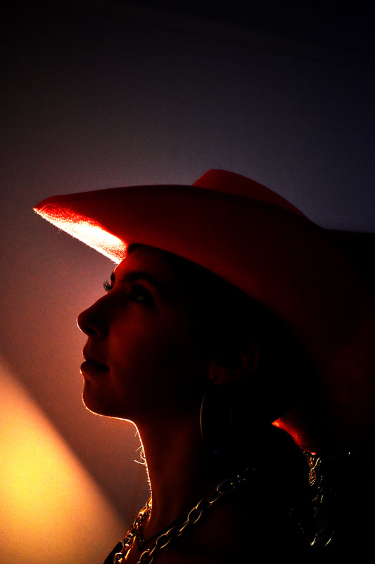
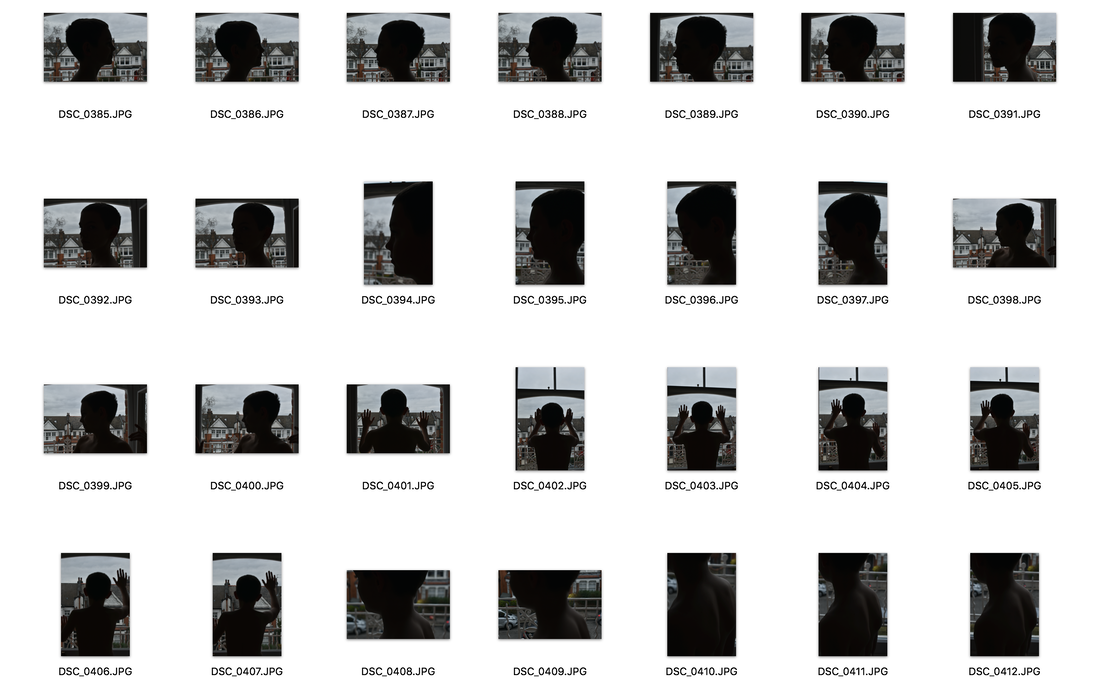
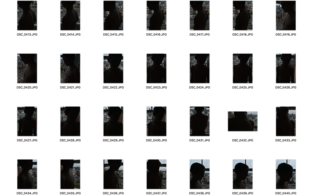
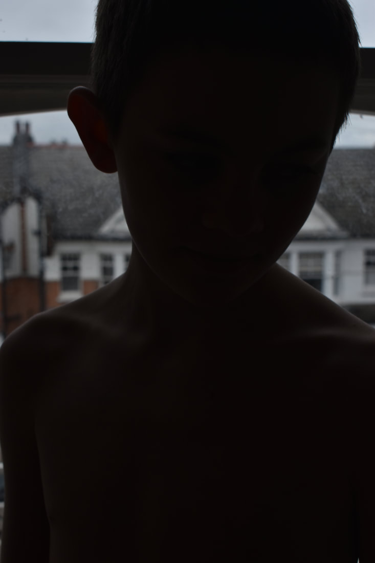
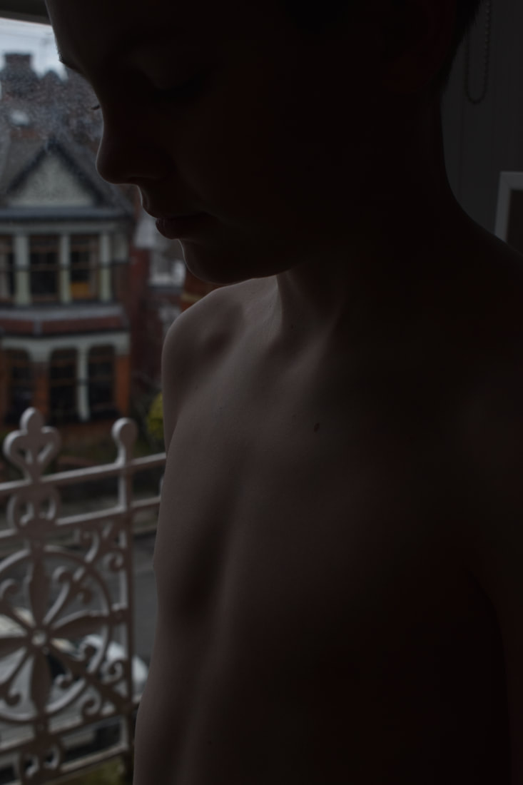
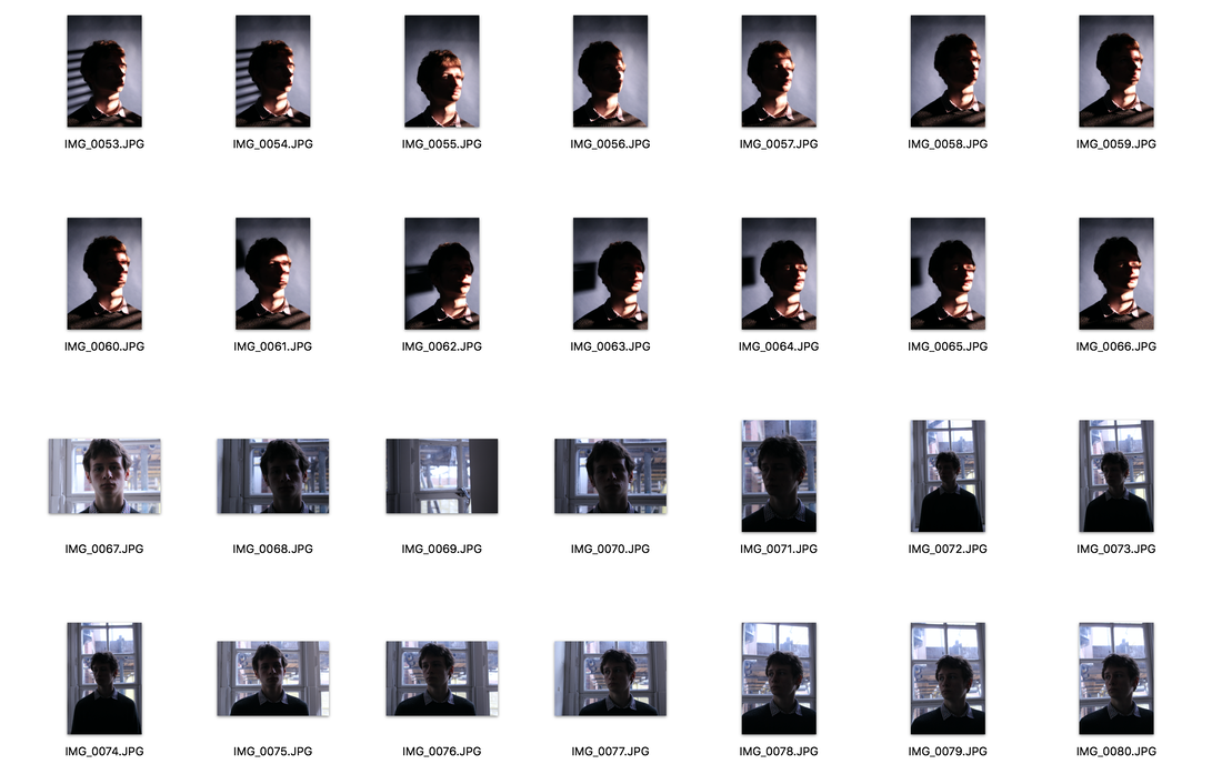
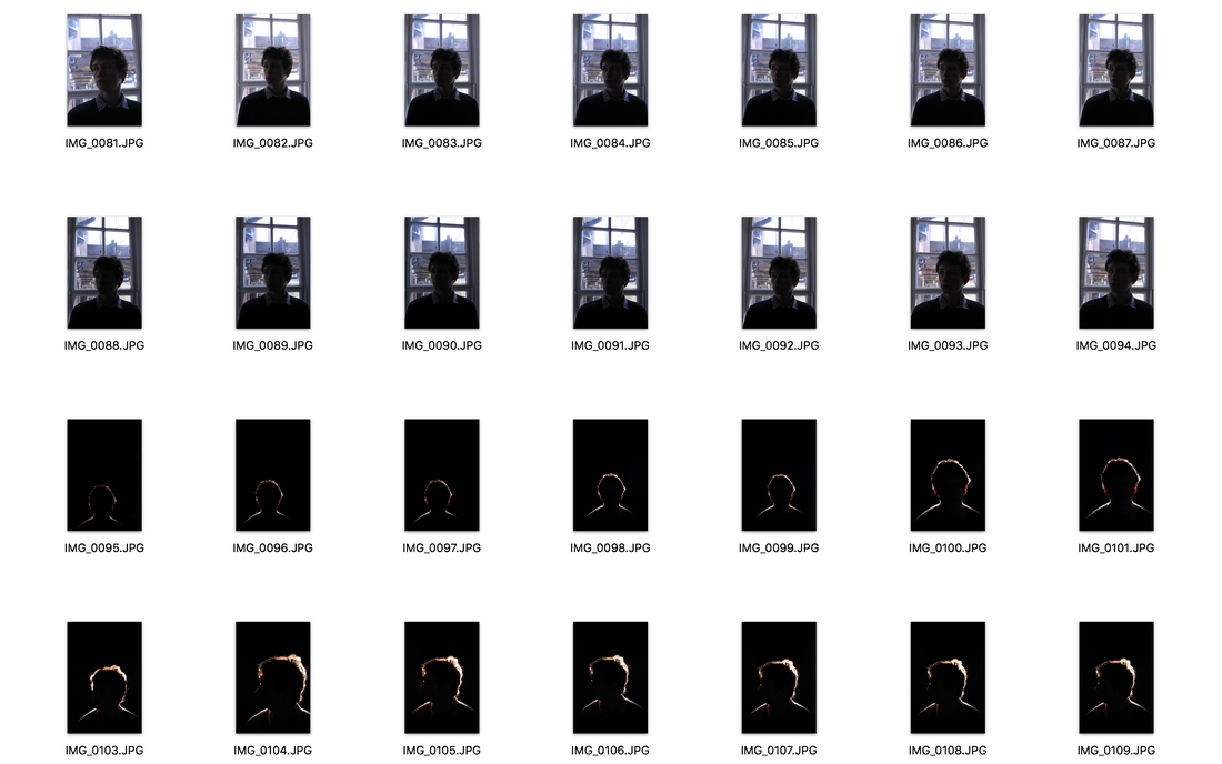
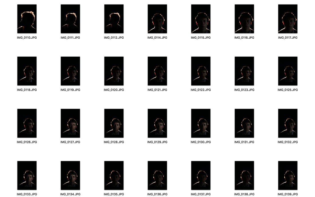
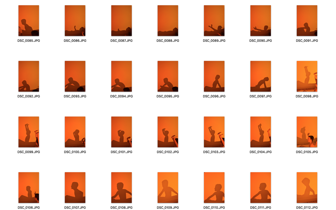
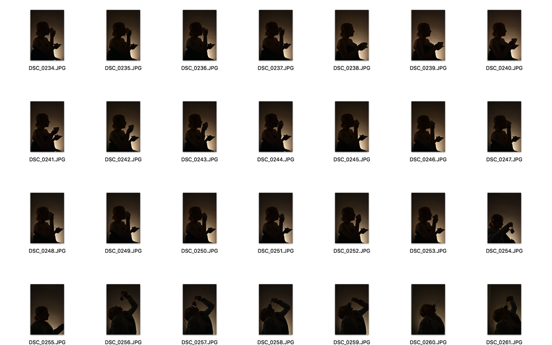
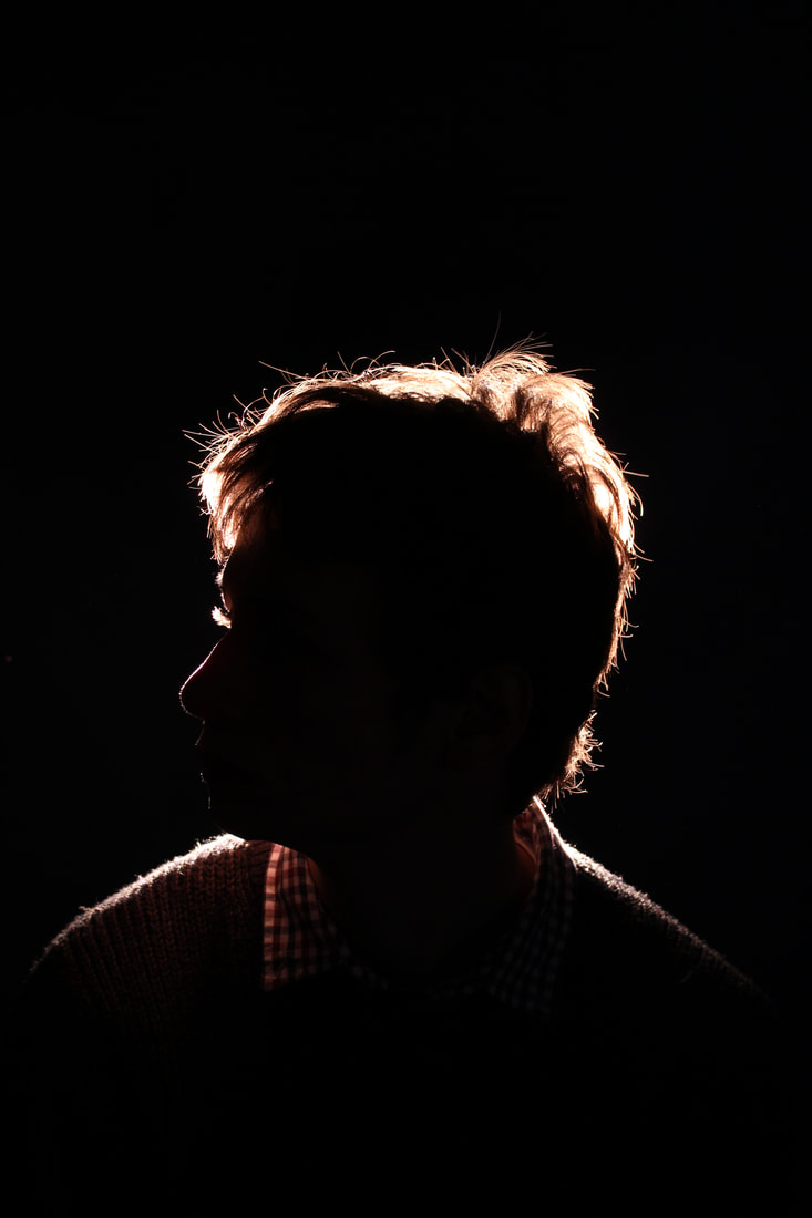
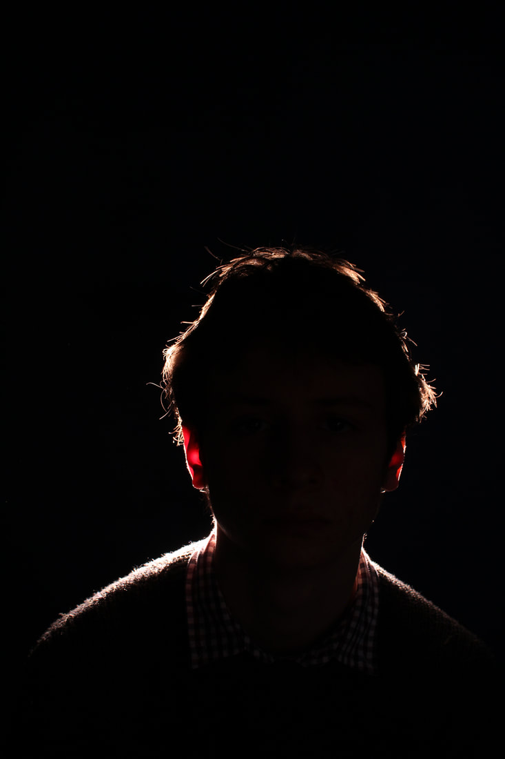
Strand 1: Jack Davison Abstraction using shadow
Davison is a london based photographer who originally studied english literature but spend most of his time taking photographs and experimenting with cameras. I am looking at some of his work using light and shadow to create these interesting siluettes of people. there is not much about him on the internet apart from the fact that he has come oust with two photography books showcasing all different kinds of work.
|
|
|
|
|
|
|
|
|
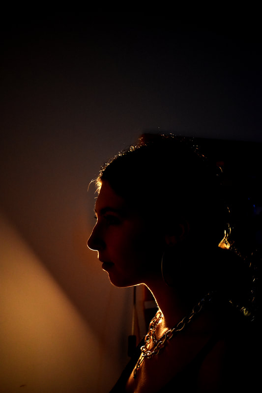
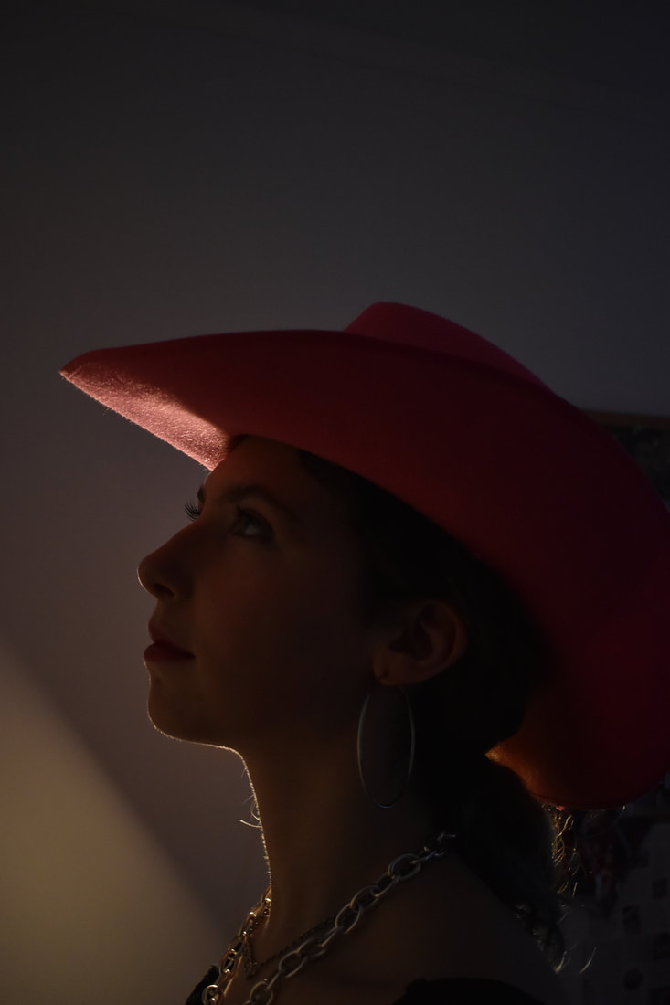
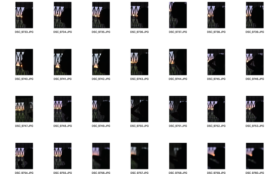
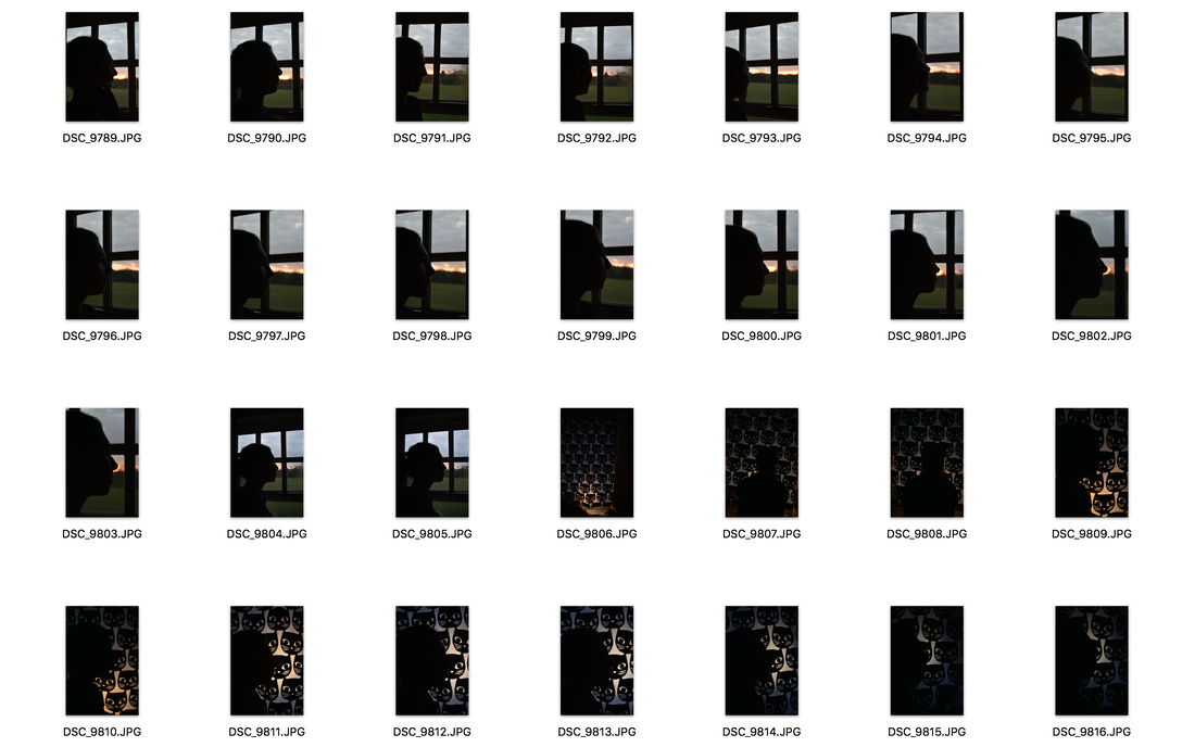
To create more of a silhouette place the model in front of a window and make sure that you camera meters for the outside light. This should place your model into silhouette. Look at more work by Jack Davison for more inspiration and the way he adds colour as shown in the images above https://www.ignant.com/2020/11/03/steeped-in-mystery-jack-davisons-latest-photographic-works-epitomize-his-distinguished-style/
Consider the genre of film noir and look at the examples of how they used silhouette to create suspense and intrigue
George Hurrell
Look also at the silhouette work of FRANÇOIS FONTAINE
|
|
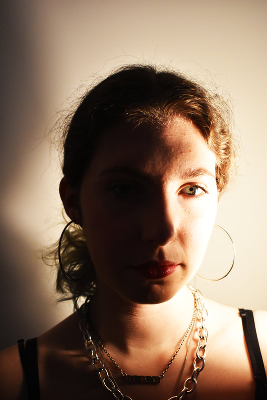
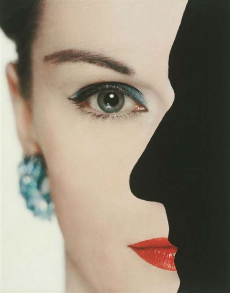
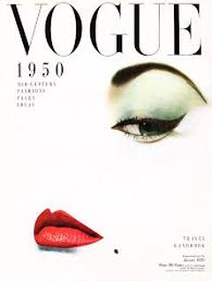
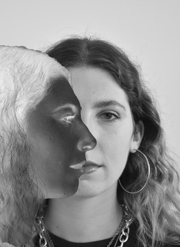
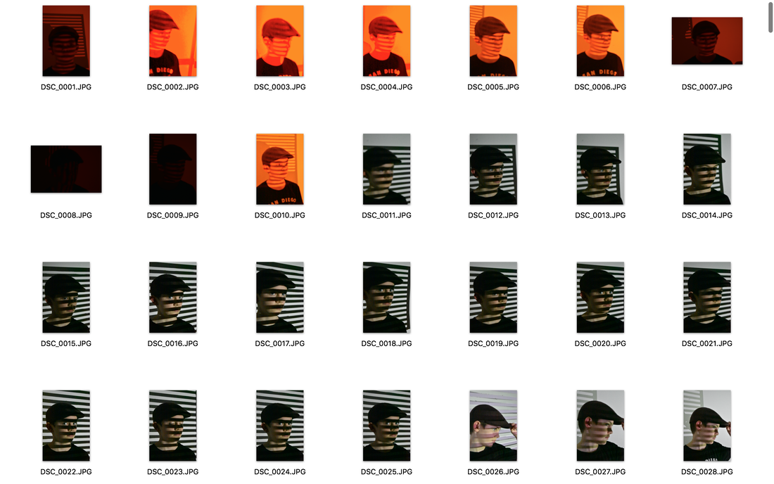
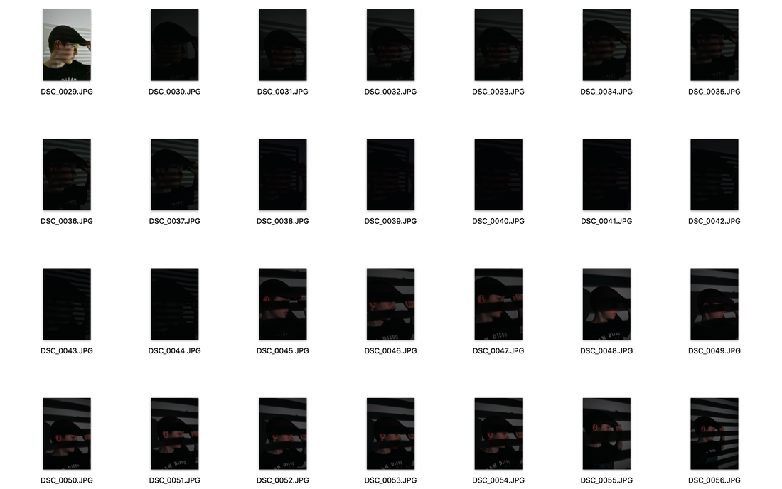
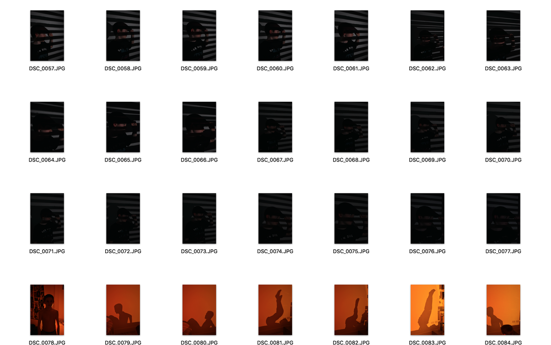
Strand 2: Erwin Blumenfeld
erwin blumenfeld was a german photographer who emigrated to the USA in the 1940s where he became a very sucessful and highly paid fashion photographer working for big brands like harpers bazar and vouge. He produced an extensive body or work over the years but i am looking at some of his fashion photos and his obsession with beautiful women. Unlike some photographers he didnt have a trademark style but insted had photgraphed these women in all diferent ways using different technique that even made some of the best photographers like rankin wish they had thought of what he did and wish they had done what he did. and he really defined how we see the 1940s and 50s in america as it was booming with sucess after the war. i also think the fact he was an immigrat helped as it showed an outsiders view on that crazy place particularly as a european.
|
|
|
|
|
|
|
|
|
Please add your third strand to this section
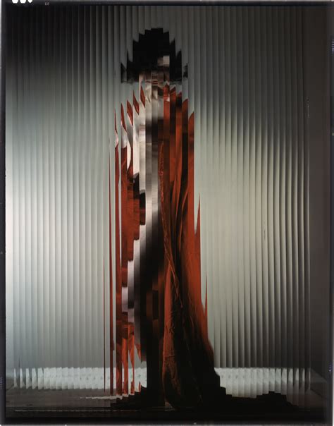
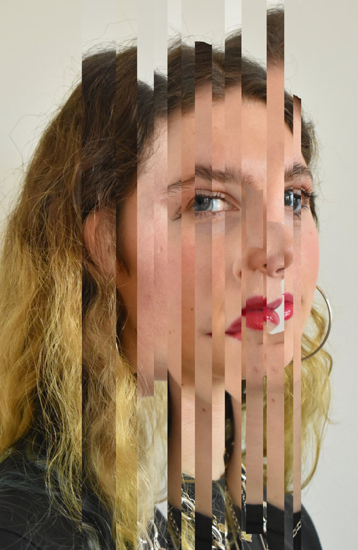
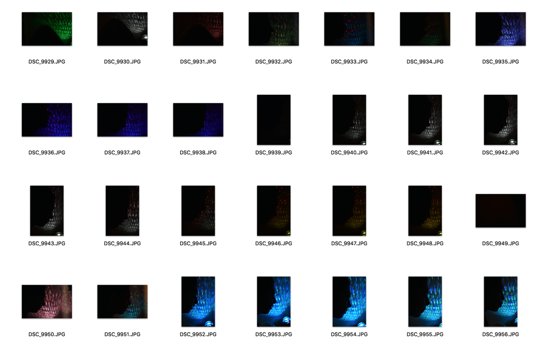
Strand 3: Matthieu Venot
|


|
i like the complexity of these photos in my third strand compaerd to my more basic ones in the Matthieu Venot set task however they could be exictued better as there are lots of gaps between the colours where you can see the original photo. if i wwas to do it again i would be more careful and take more time when editing them
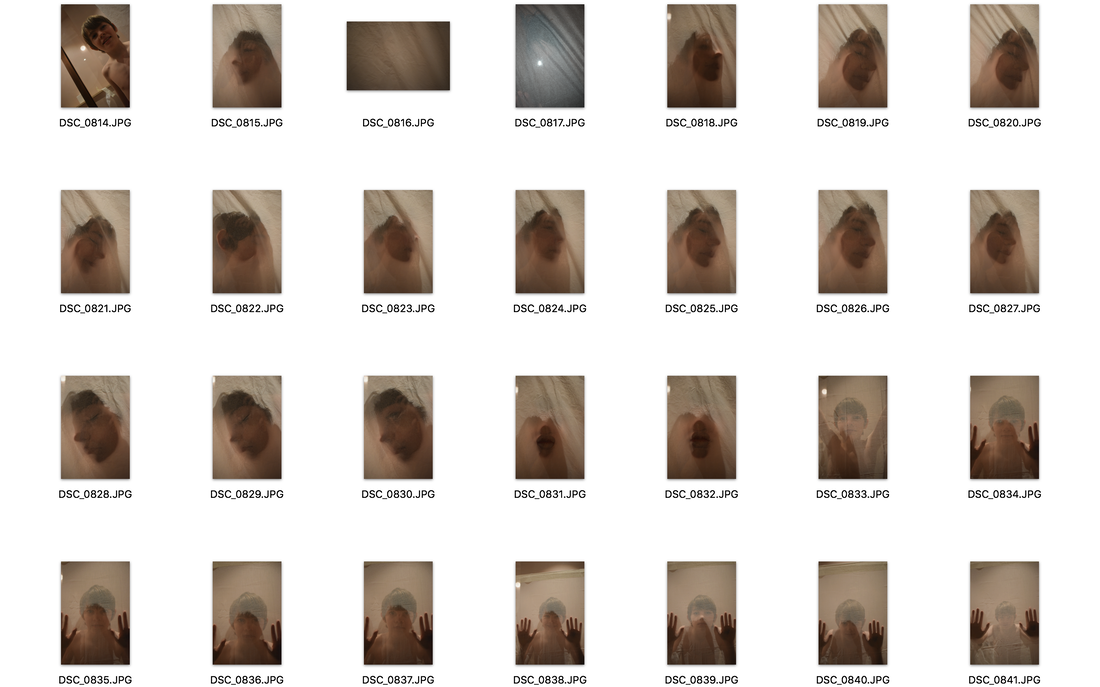
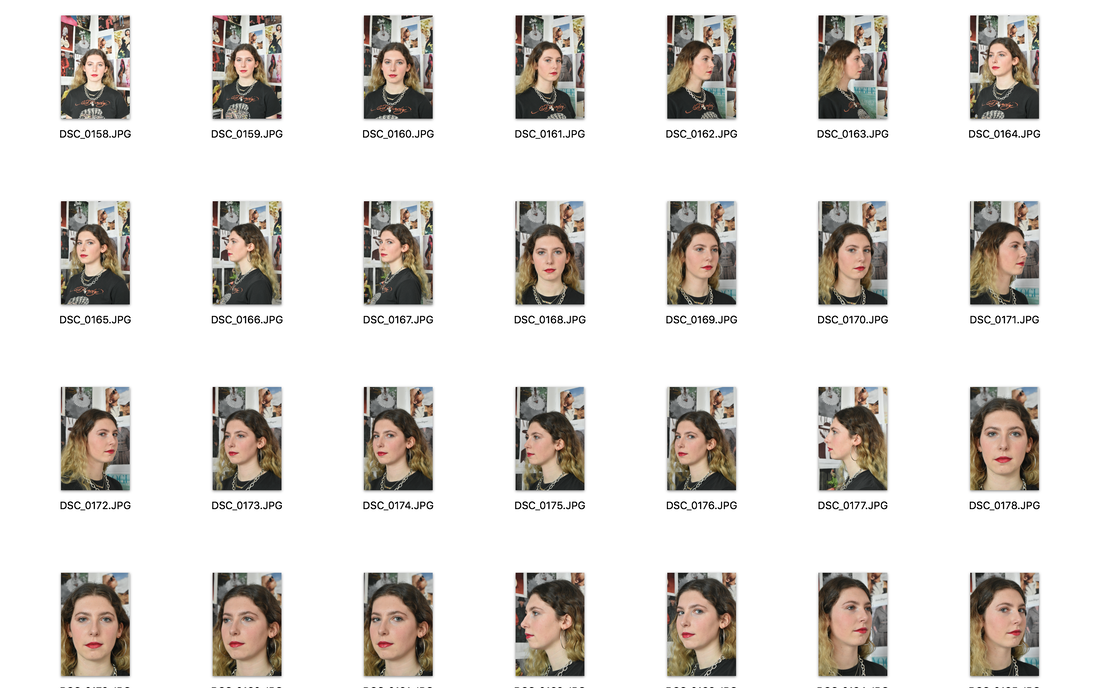
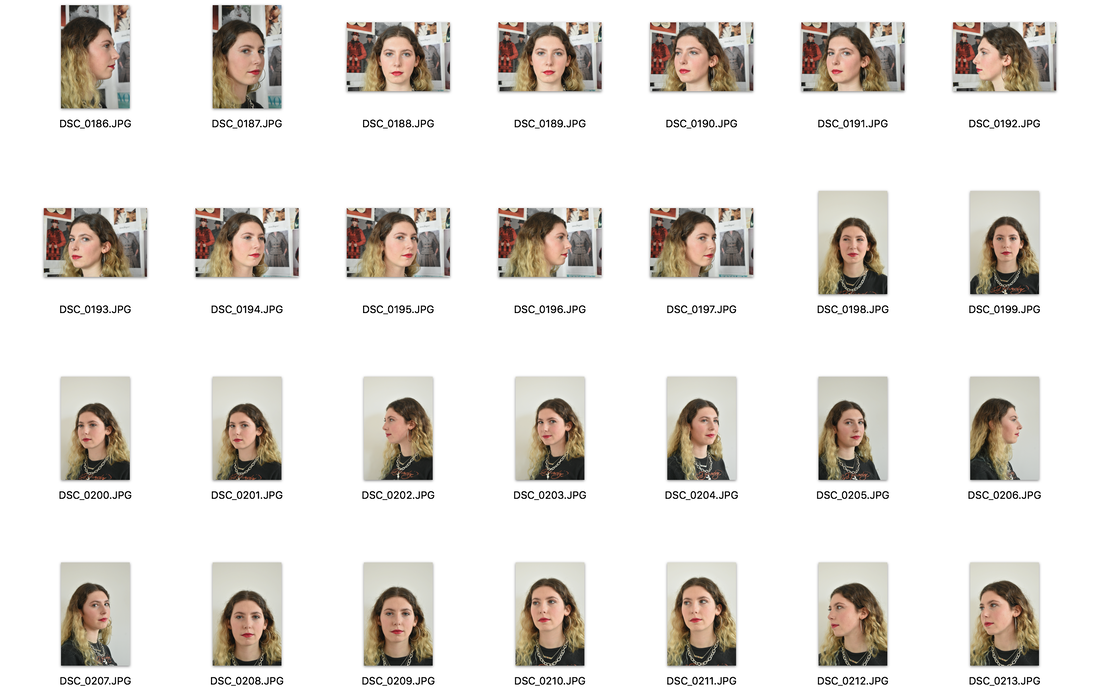
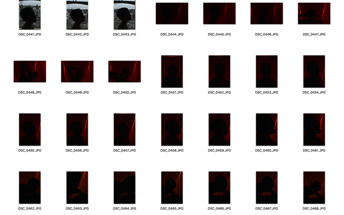
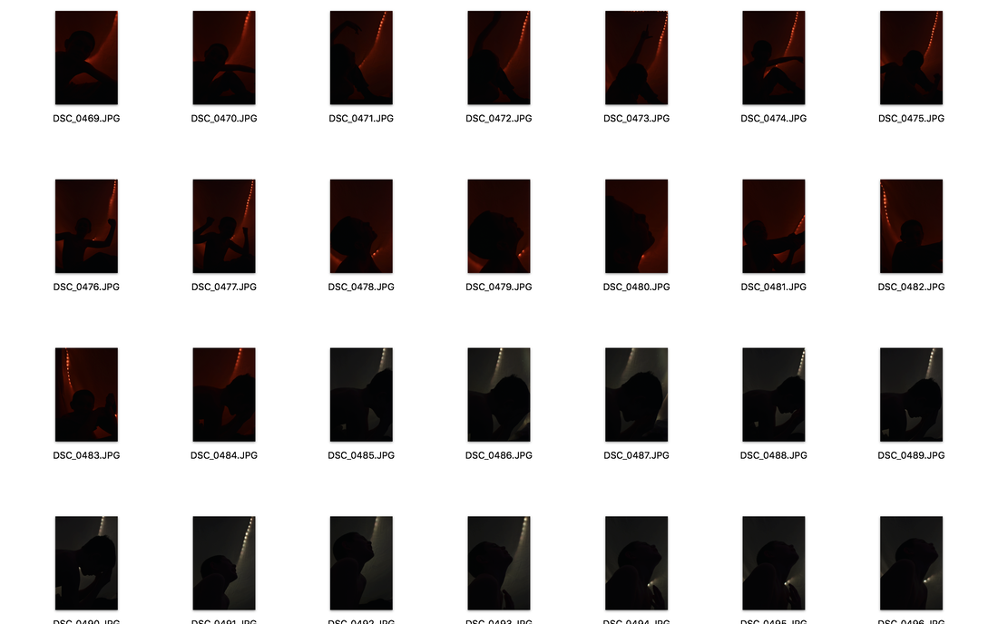
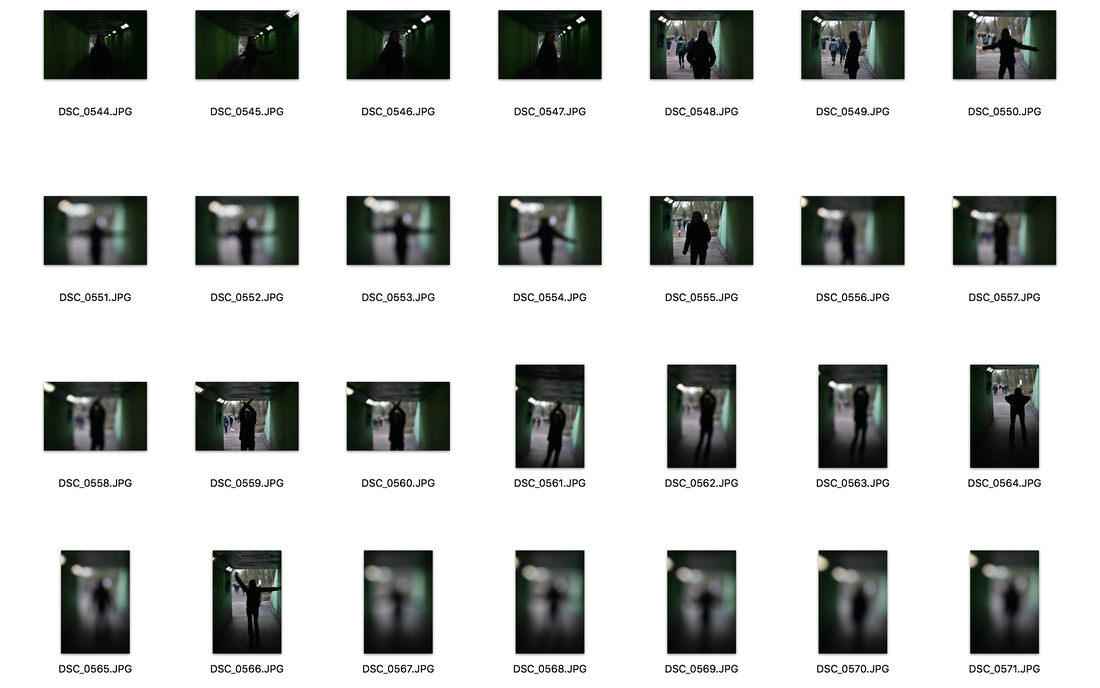
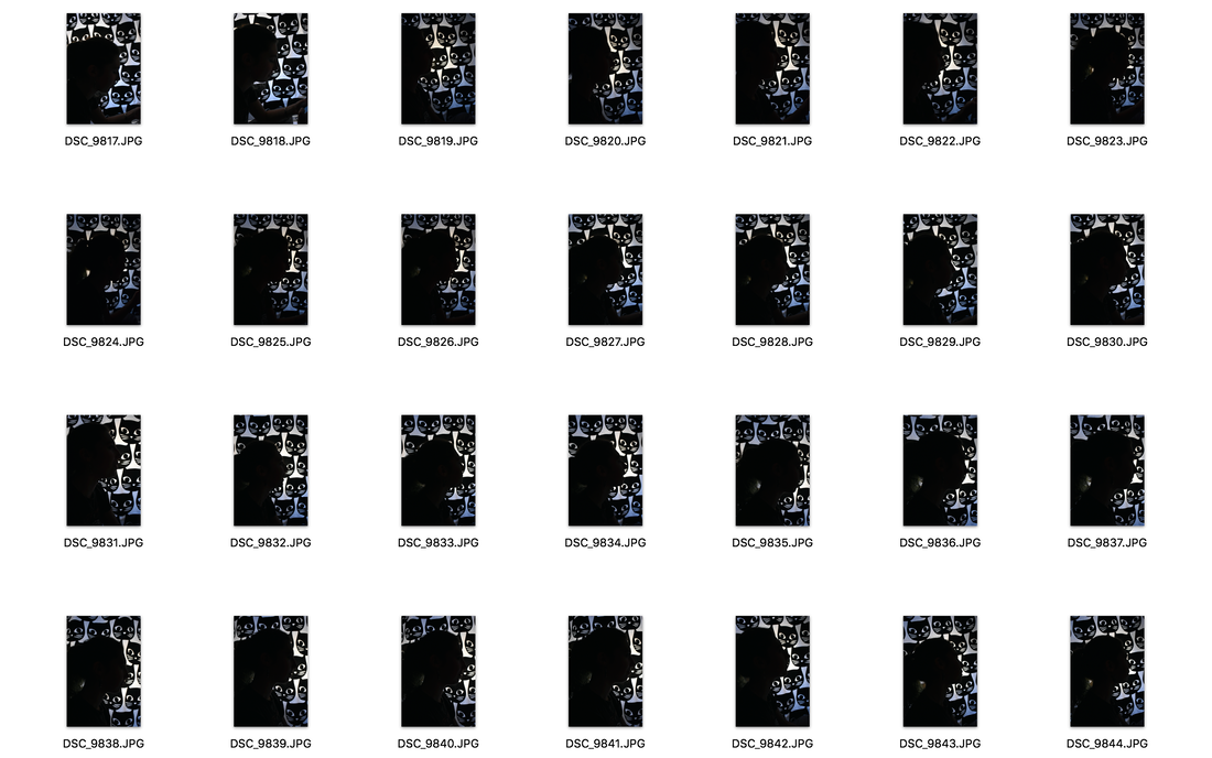
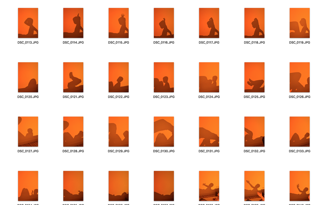
Development 1
|
|
|
|
|
FRANÇOIS FONTAINE
|
|
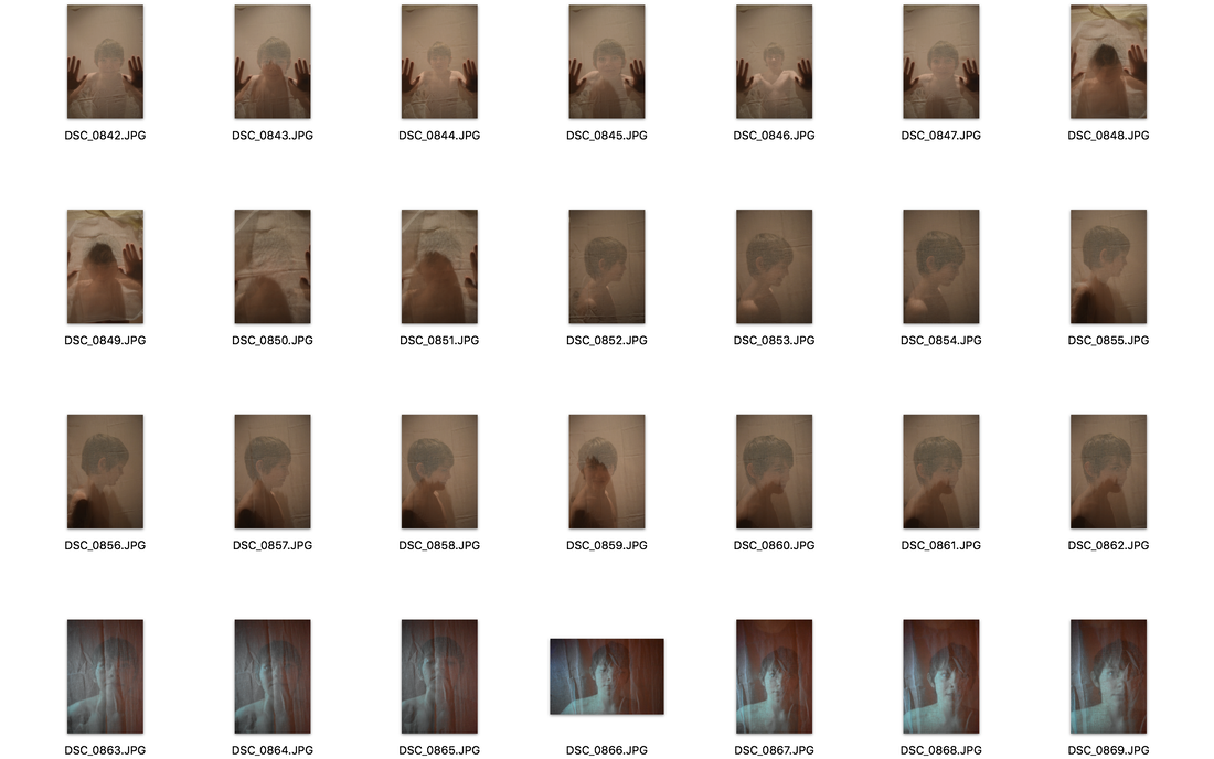
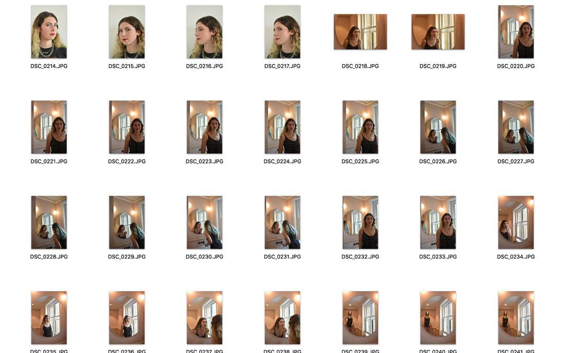
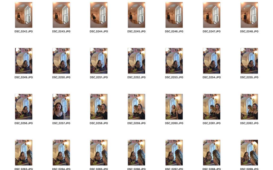
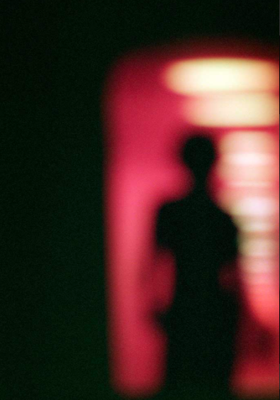
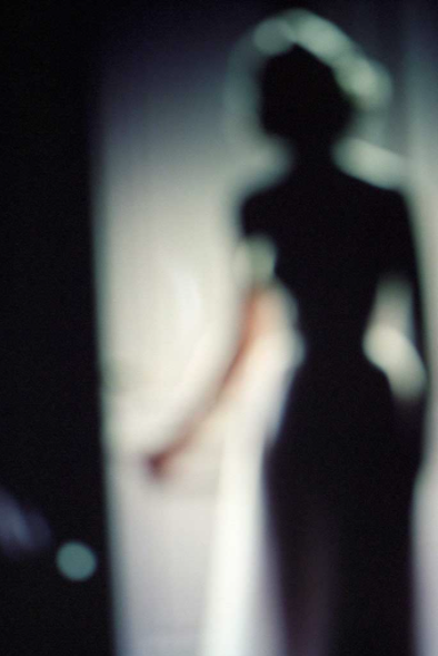
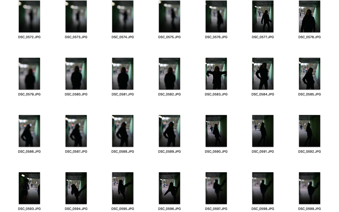
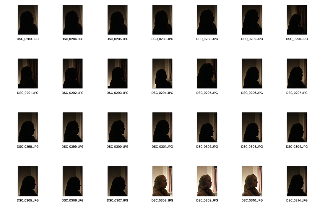
Development 2
|
|
|
|
|
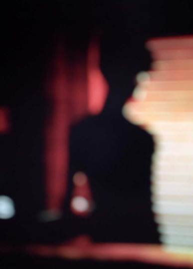
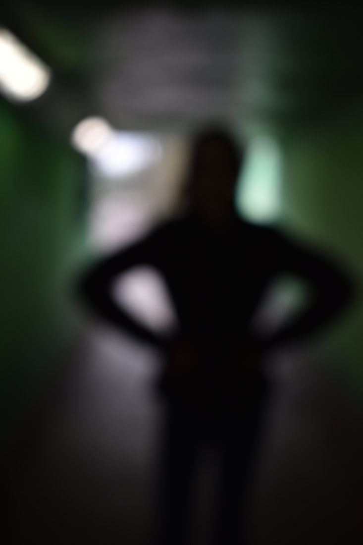
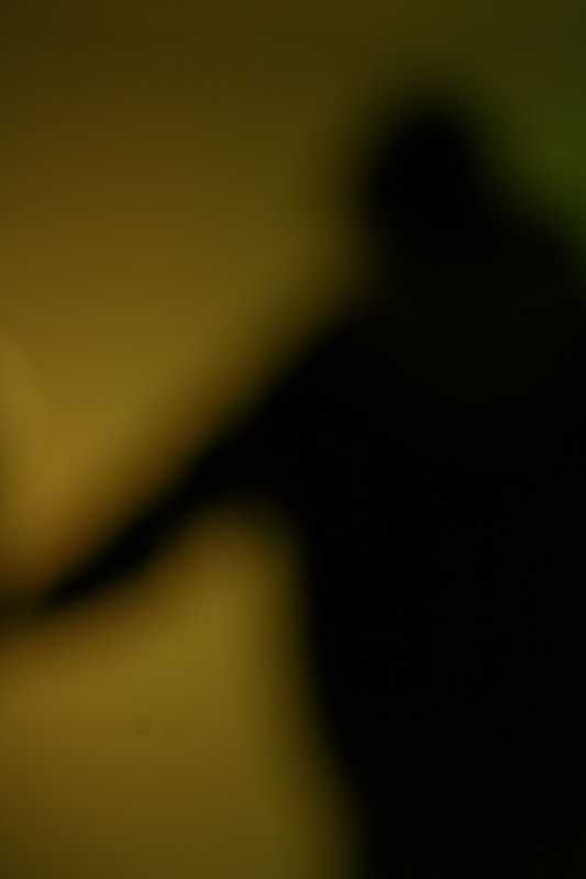
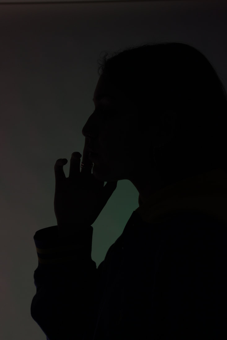
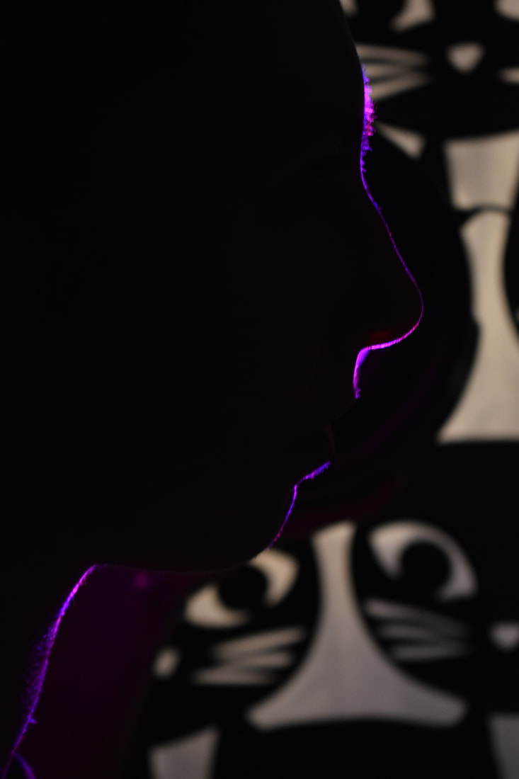
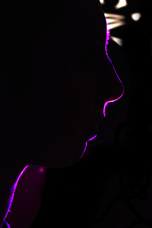
these are my favourite photos from my second development as you can see her body better as they are the most in focus of all the photos i took. however, i dont really like the background so next time i shoot i would choose a different background with more colour so it is more similar to the work of fransoius fontaine
In my second development i expreimented with different focuses but i think i made them a bit too out of focus because in the photos just above it looks a bit messy and you cant really see what is in the image. next time i would go closer too the subject and have it slightly more in focus
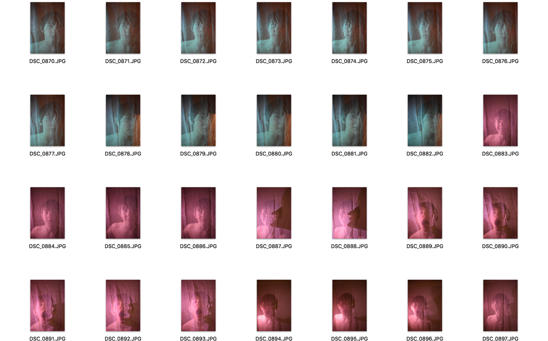
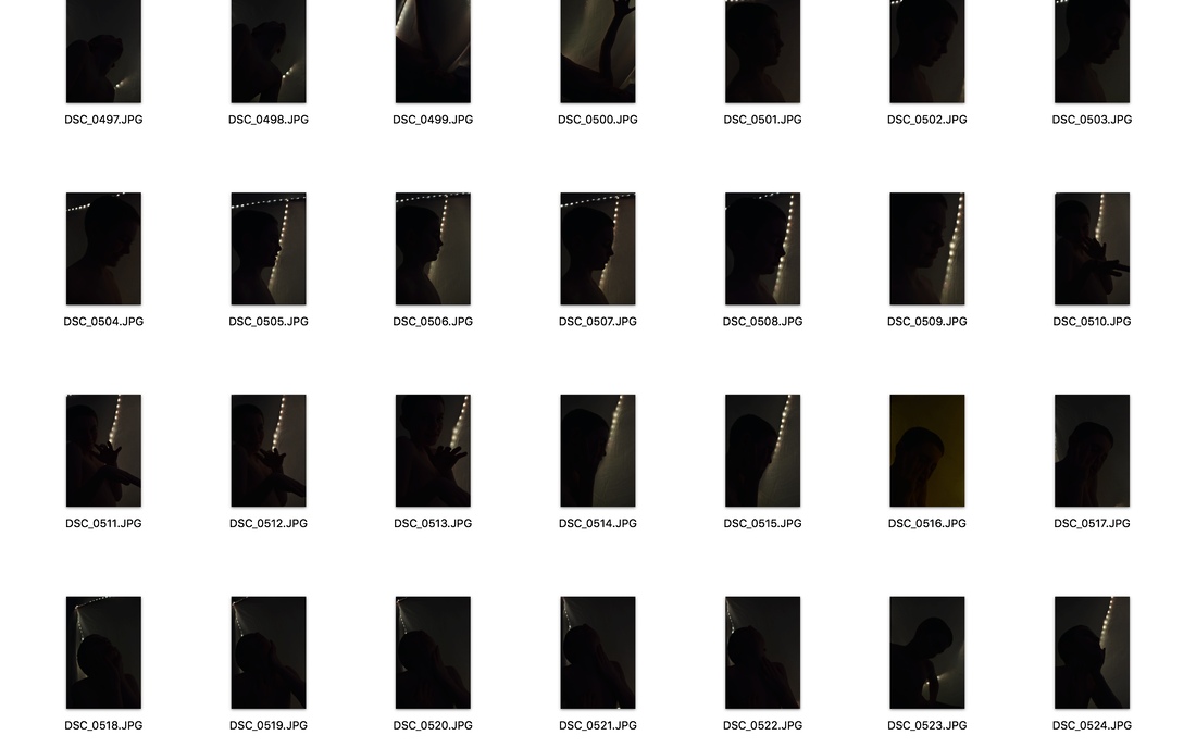
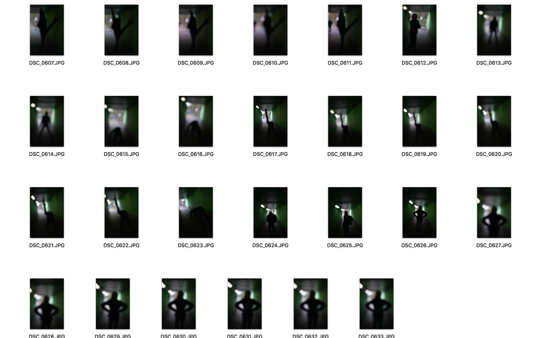
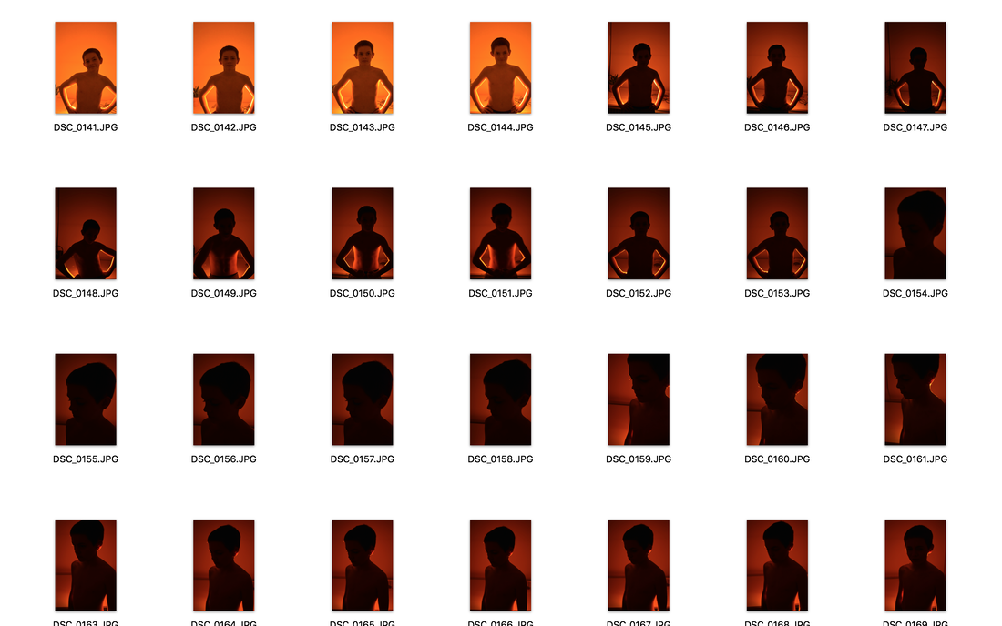
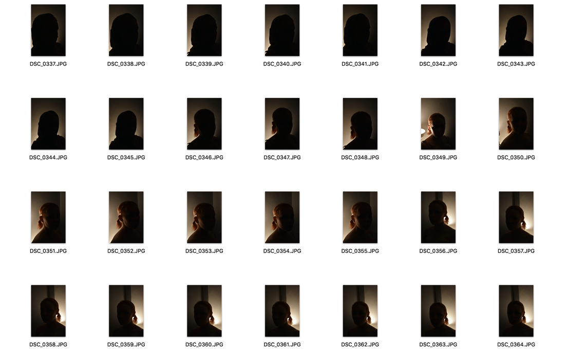
Development 3
|
|

|
|
|
|
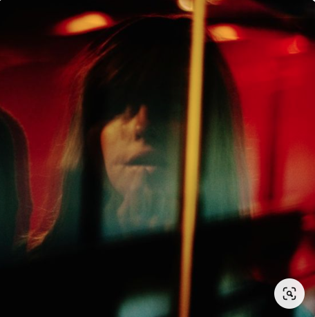
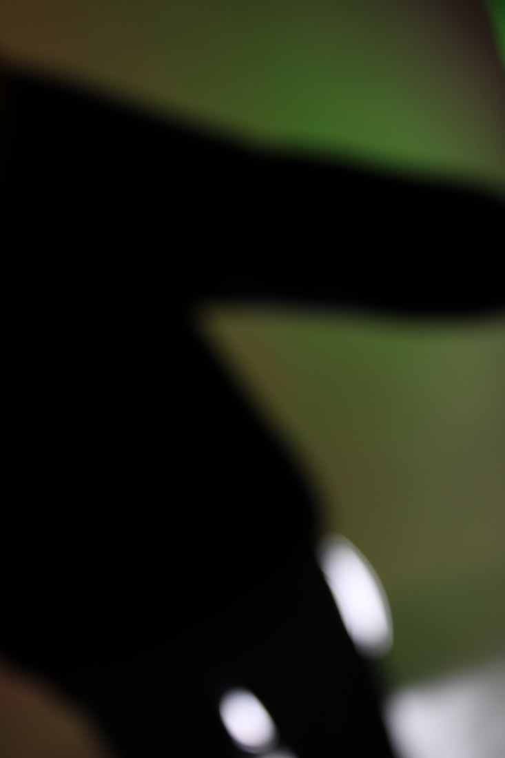
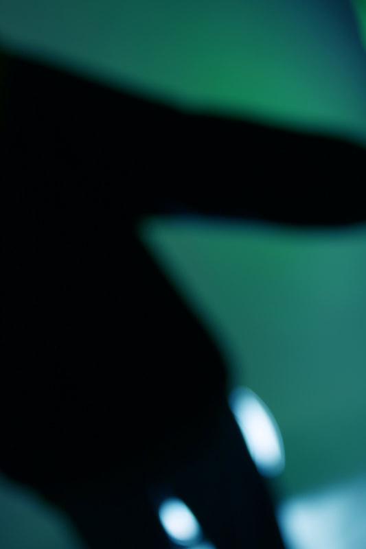
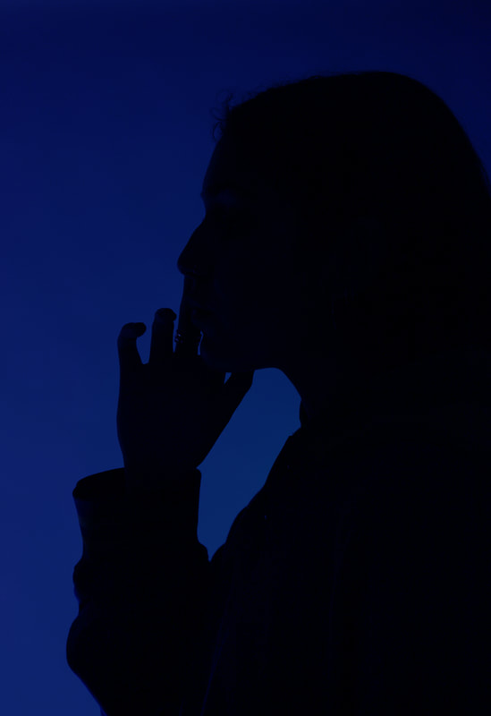
i dont really like this development at all i think its very boring and i dont like the shapes of the shiluettes however i did achieve the coloured background i wanted in the second development. I think i prefer the images with a sharp focus so that is what i am going to focus on in my next development.
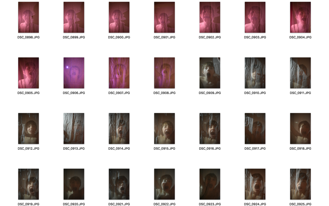
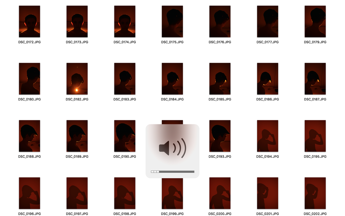
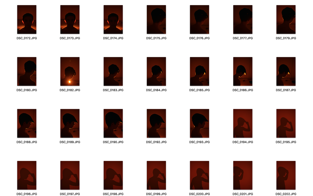
Development 4
i tried to do a 4th development on film with a mix of sharp and blurry focus however both the times my film came out completely clear so i am going to go back to digital and try some more different backgrounds. I like how in jack davisons work the people look more natural and the poses look less forced. For my next part of my 4th development i am going take photos of people in front of shop windows so i can have different backgrounds for my silhouettes.
in this development as i wasnt exactly sure what i wanted to do i ended up looking at different editing techniques
|
|
|
|
|
|
|
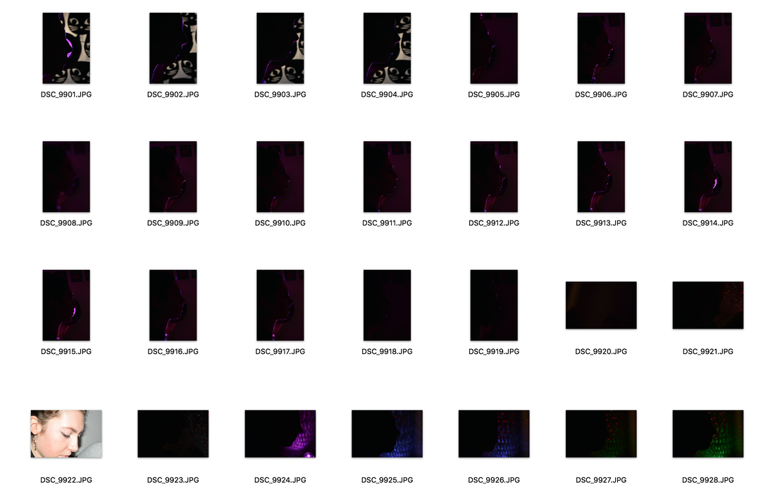
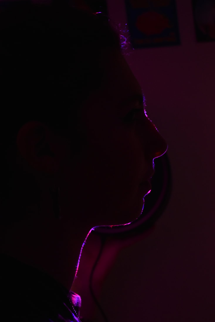
for the image on the left i wanted to get rid of everything in the image apart from the shilluette so i increased the contrast and cloned out the background and also made the colour more vibrant.
|
|
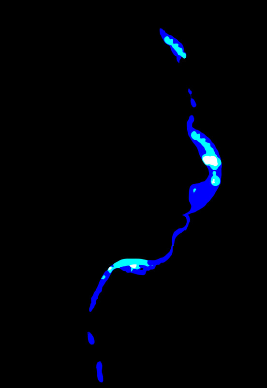
Here i posterised the image to reduce it to fewer colours and get a sharper side profile as the original image was a bit out of focus
|
|
|
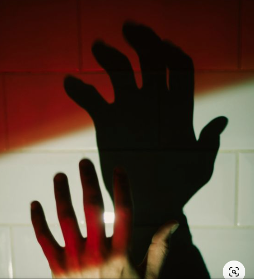
on this photo i added a colour gradient on the background to increace the shilluette contrast
|
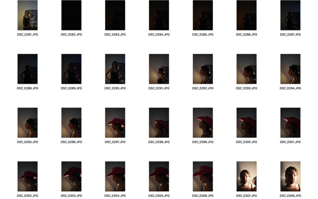
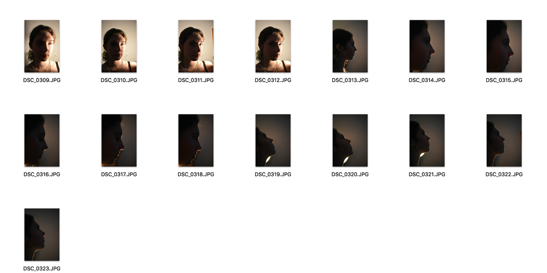
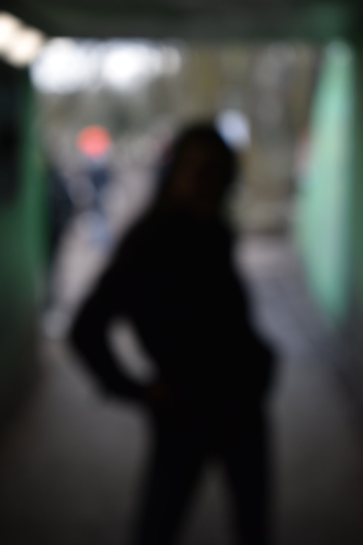
Final shoot

|
|